Four Square
New Zealand’s iconic supermarket.
—
Brand design for Four Square
Four Square have been faithfully serving their communities for almost a century but needed a new visual identity to equip them as they step into a new phase as a business. This is expressed with the new brand positioning; ‘What’ll it be today?’ This acknowledges that life sometimes means you’ve run out of tomato sauce, or that packet of yeast at the back of the cupboard has expired. Four Square will be there to help — and with a smile.
Note: This project was completed while Josh was employed by FCB, and they have graciously allowed its publication here.
The logo itself was finessed in a way that likely no one will notice the difference at all. It was actually a substantial shift, bringing ‘FOUR’ inside the box, alongside some careful kerning, to create a compact mark that would work across all comms.
A dedicated lock-up was also created to incorporate Charlie, and a system implemented for consistent store logos.
Primary
Stacked
Logo
Lock-Up
Store
Specific
Logo
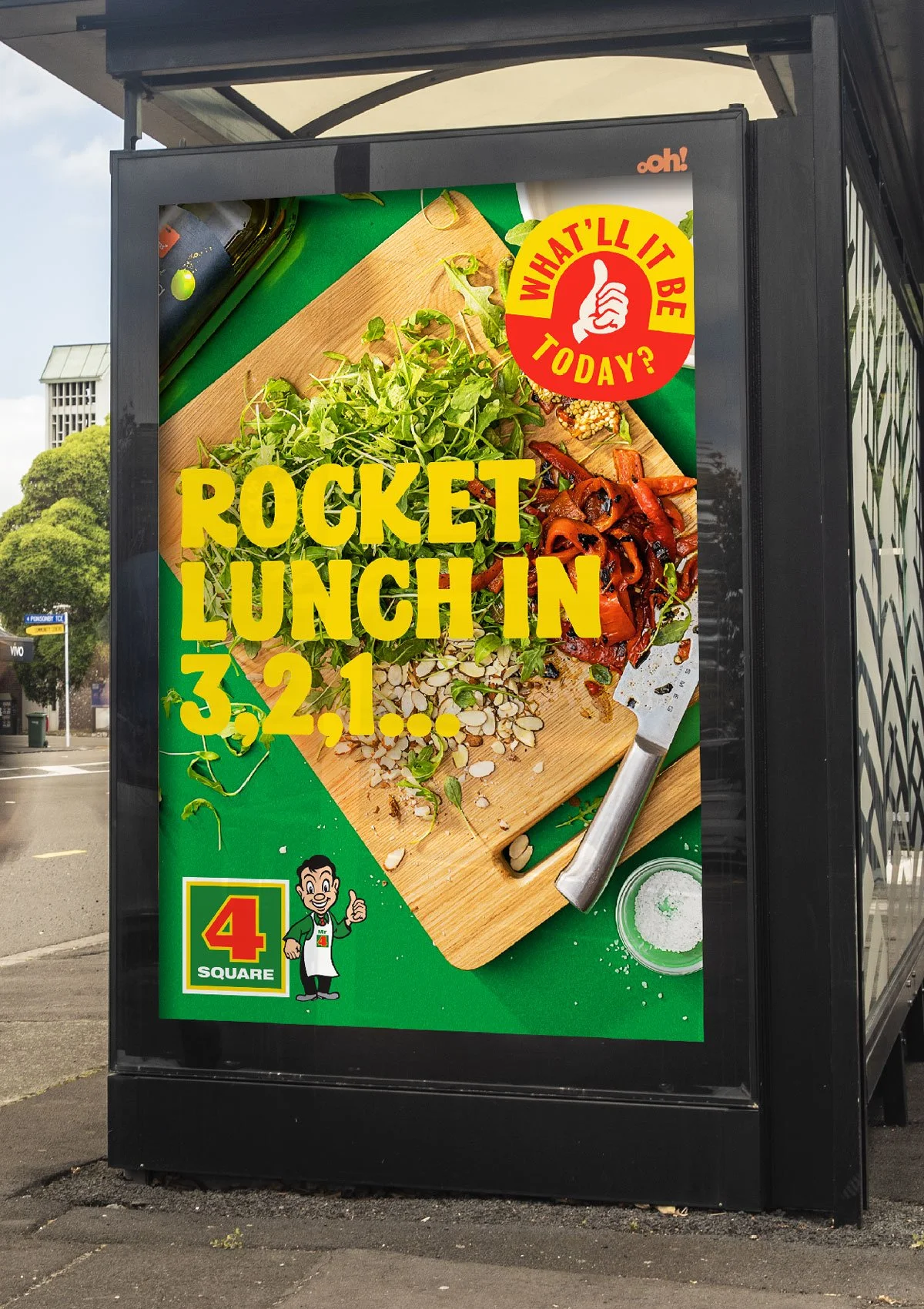
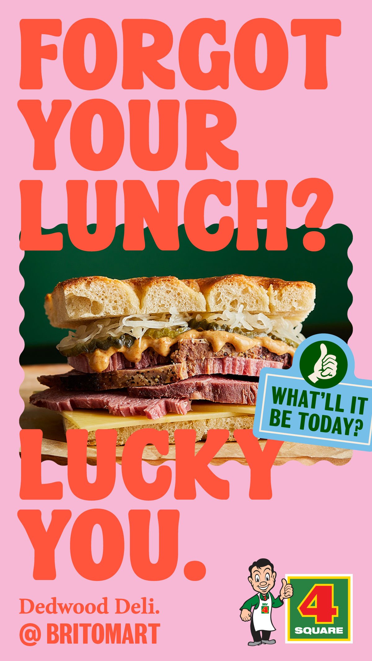
The new identity needed to match that bright and positive sentiment, and cut through in a crowded marketing environment. This was anchored by a new brand typeface, which was developed to convey the brand sentiment in the most effective way, and enhancing the witty tone of voice.
A second typeface, a playful reworking of Grotesque No.9, is utilised in secondary copy, and the stickers that hero the positioning line.
The photographic direction became a celebration of the ordinary, finding the magic mid-meal with hungry fingers plucking a tomato off a plate, or in the aftermath of a panicked baking session. Reflective of everyday life and establishing a distinctive, human-centric approach that sits in refreshing contrast to the generic images of their competitors.
Our images are sorted into three distinctive buckets, that ensure diversity in our communications, and demonstrate the breadth of our brand promise.
Still Life
Studio
Enjoyment
The colour palette was strengthened, extending into a supporting palette that supported the primary tones, and gave use more tonal flex in our comms.
Rigorous guidelines help to ensure consistent application, as we use colour blocking and tone-on-tone almost religiously.
Primary Palette
Secondary Palette
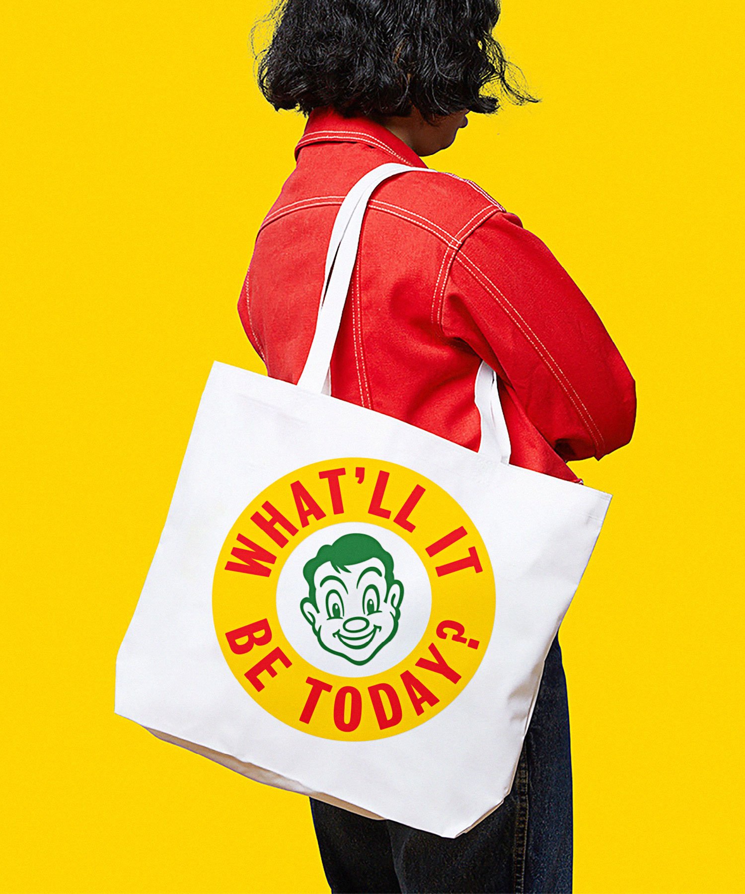
The ensuing years have seen Four Square authentically connecting with Kiwis. Recently it launched a new store in Britomart, and celebrated its 100th anniversary with a popular release of a merch range, and a series of ‘brollabs’ with other iconic New Zealand brands.
Likely Suspects:
Josh O’Neill (at FCB)
Collaborators:
Photography by Victoria Baldwin & Michael Braid, Strategy, Project management & Creative Direction by the wider FCB New Zealand team.


