Ruby’s
A casual brand for some serious food.
—
Brand and environmental graphics for Ruby’s
Ruby’s is the best Mexican restaurant this side of the Pacific. They came to us with a desire to refresh their brand, and appeal more strategically to their local Papamoa-based customers.
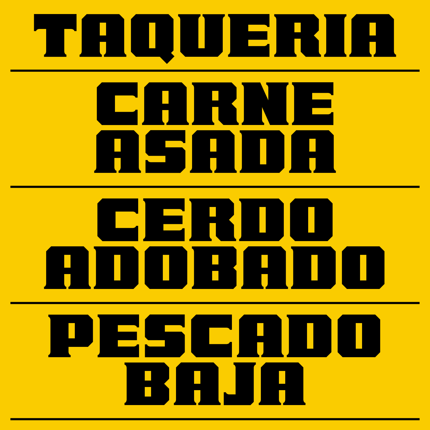
We took an approach that didn’t lean too far into a typical ‘authentic’ look, instead aiming to sit a little more on the ‘fun’ side, reflective of their approach to service.
Primary Logo
The key to the brand is the custom typeface we created. LS Torta (named after one of our favourite dishes) is a blocky display typeface that puts a spin on heritage Mexican slab type. This gives Ruby’s an economical way to easily design their own promotional material, creating distinctive communications that feel neatly aligned. We also overhauled the colour palette, simplifying things down, but keeping things plenty colourful and bold.
LS Torta
The end result is a tasty blend of simple ingredients, much like their tacos. LS Torta does a lot of heavy lifting, and distinctly brands anything it touches.
Likely Suspects:
Josh O’Neill
Collaborators:
Photography by Mon Omori, Phil Mountfort & Sam Odea
Visit Ruby’s website


